Project Overview
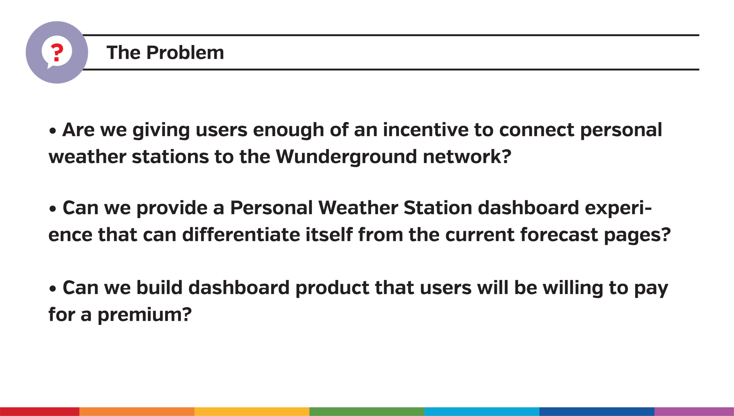
The Problem:
Are we giving users enough of an incentive to connect personal weather stations to the Weather Underground network? Can we differentiate the dashboard experience against weather forecast pages?
My Role:
User research, User testing, Prototyping, Wireframing and Visual design
Team:
Todd Henry (Product Manager), Kristian Tumangan (Product Designer), Vishal Shrivastava (Lead Web Dev Manager), Jimmy Huang (Web Developer)
The Solution:
Revamping the PWS dashboard with configurable data and better data visualization capabilities will increase retention rate and increase the Personal Weather Station conversion rate.
Tools:
InVision (Prototype), Sketch (Wireframes, Visual Design, UI/UX Deliverables), Google Meet (User Interviews and In-person user testing)

Discovery
User Interviews
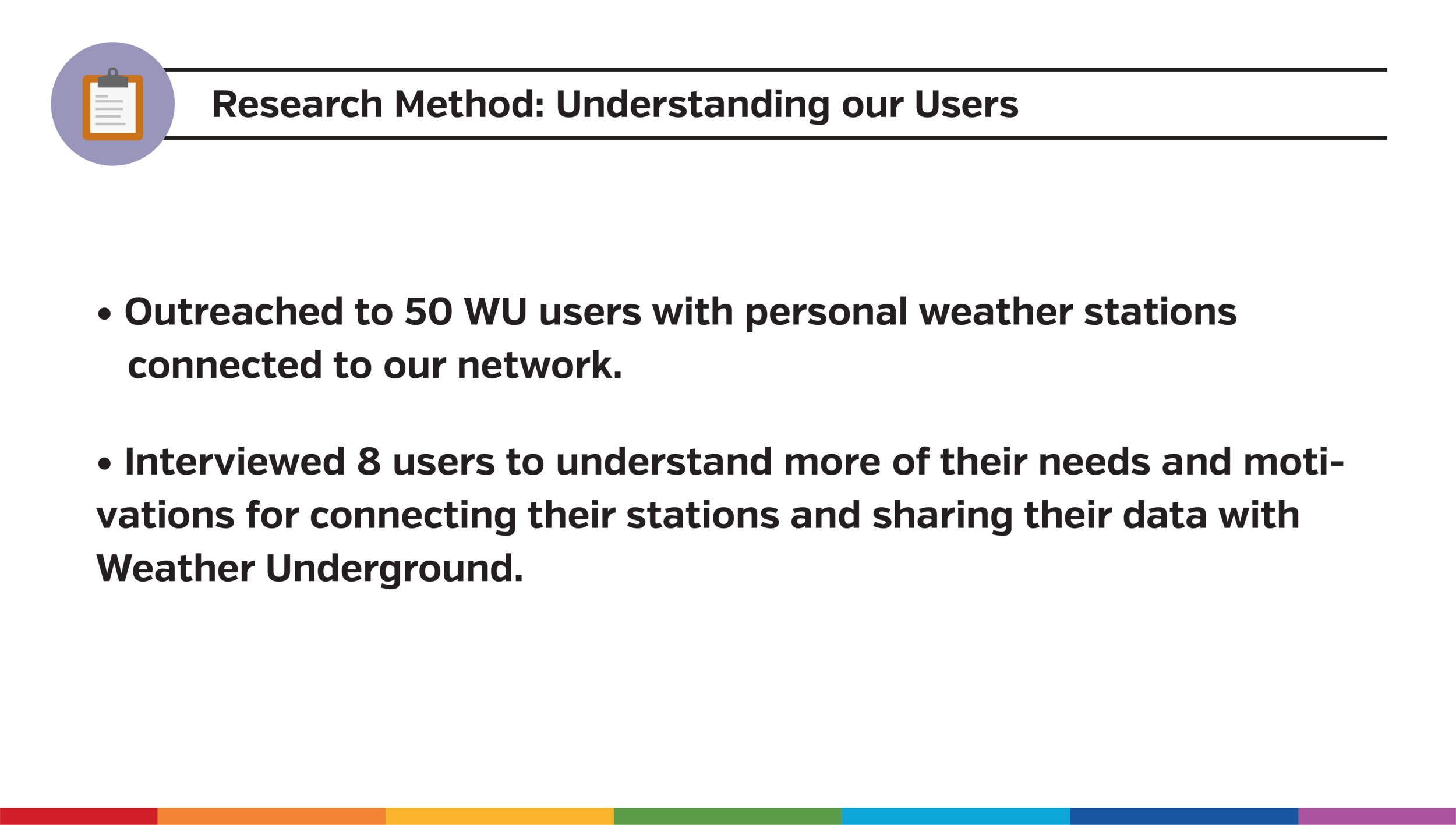
Before diving into the features and the overall UX of the dashboard, I established a user interview plan. This approach allowed me to gauge the overall motivations and needs of users for connecting their personal weather stations to share their weather station data to the Weather Underground network. I outreached to and interviewed 8 Weather Underground power users who had personal weather stations connected to our network.
Key Insights:
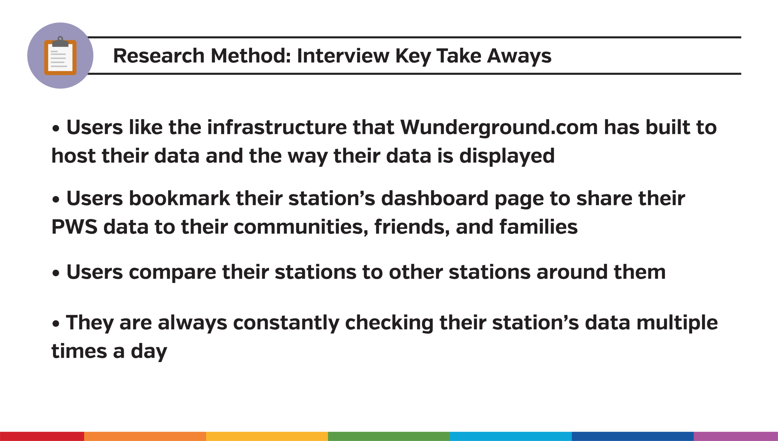
1. Users favored the infrastructure that Wunderground.com built to host their data and the way their data is displayed.
2. Users bookmark their station’s data page on Wunderground.com and share that page with their families, friends, and communities.
3. Users compare their station’s page on Wunderground.com to other stations around them.
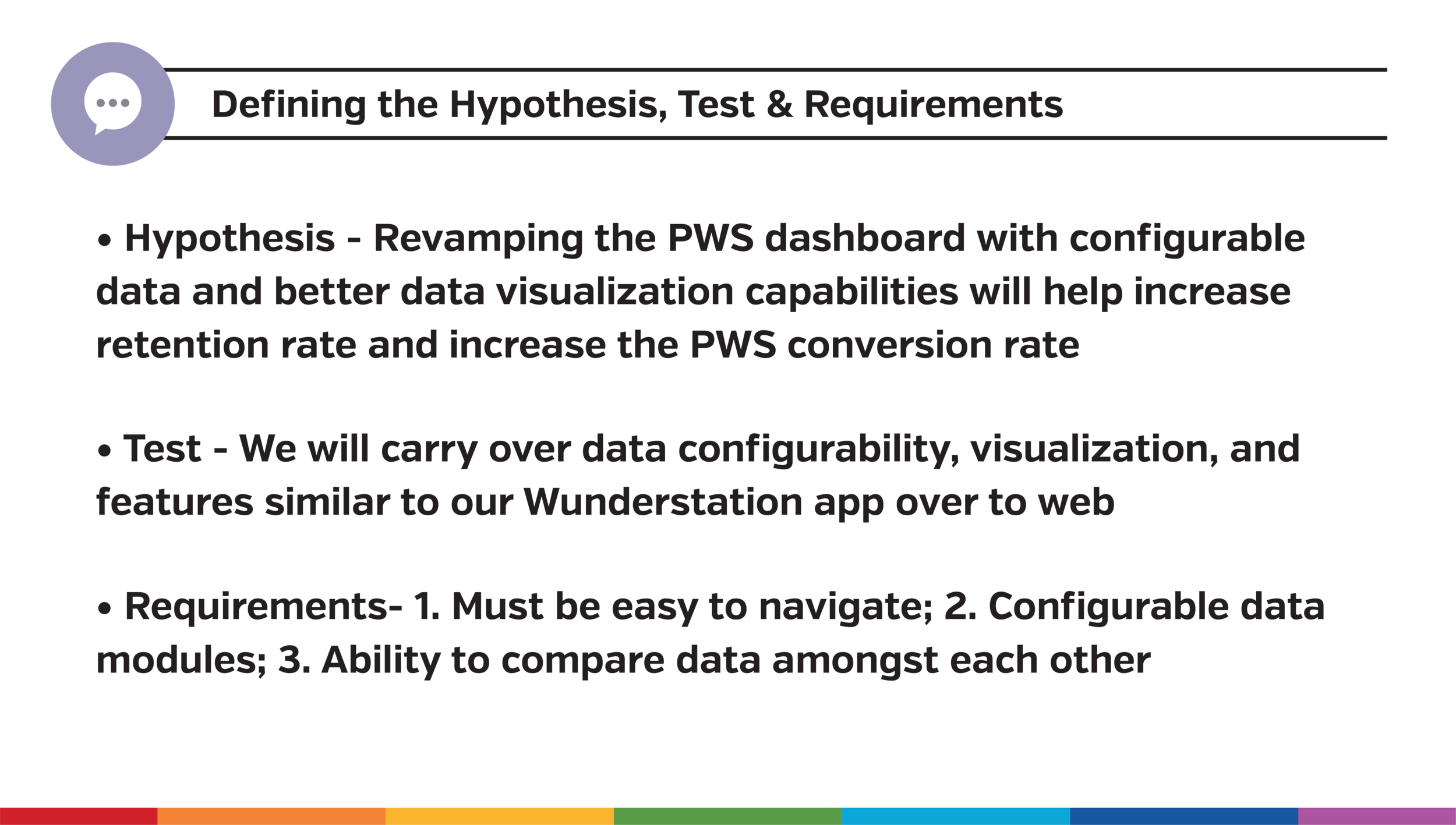
Experience Requirements:
1. Navigation: Dashboard must be easy to navigate and data visualization must be easily digestible.
2. Personalization: Users want the ability to personalize the data being displayed on the page, as well as the ability to adjust what is being displayed and shared.
3. Head-to head comparison: Allows users to easily compare data amongst each other.
Hypothesis
Revamping the personal weather station dashboard with configurable data and better data visualization capabilities will increase retention rate and the PWS conversion rate.
View Design Process Deck Below
Test Creation and Prototype
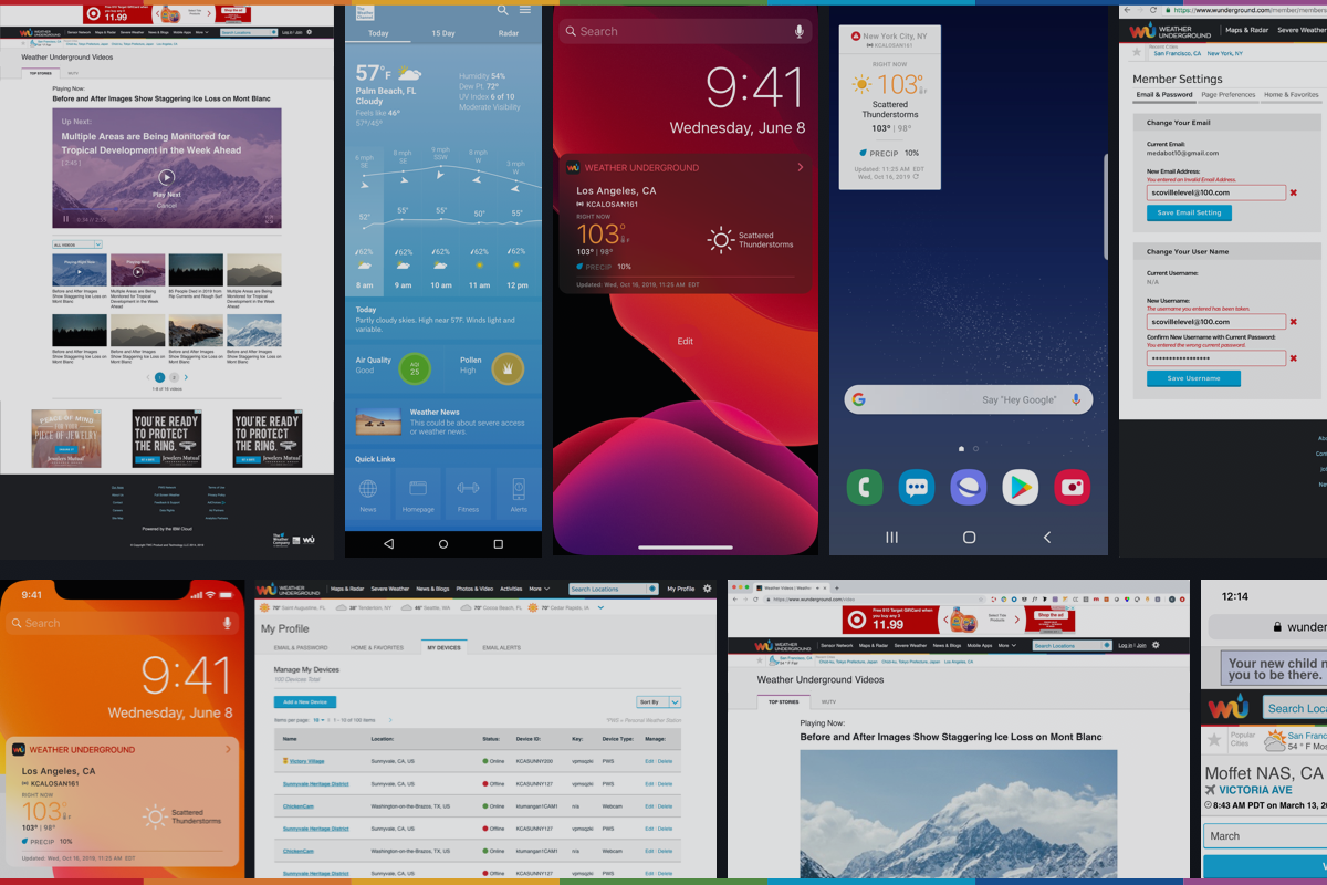
With the insights gained from the user interviews, I developed a plan to test our hypothesis. We decided to carry over data configurability and data visualization features similar to Weather Underground’s Wunderstation app over to the web’s personal weather station dashboard. The fact we were sunsetting the Wunderstation app further reinforced testing our hypothesis.


Sketching and Wunderstation app inspiration used as part of the process for prototype creation.
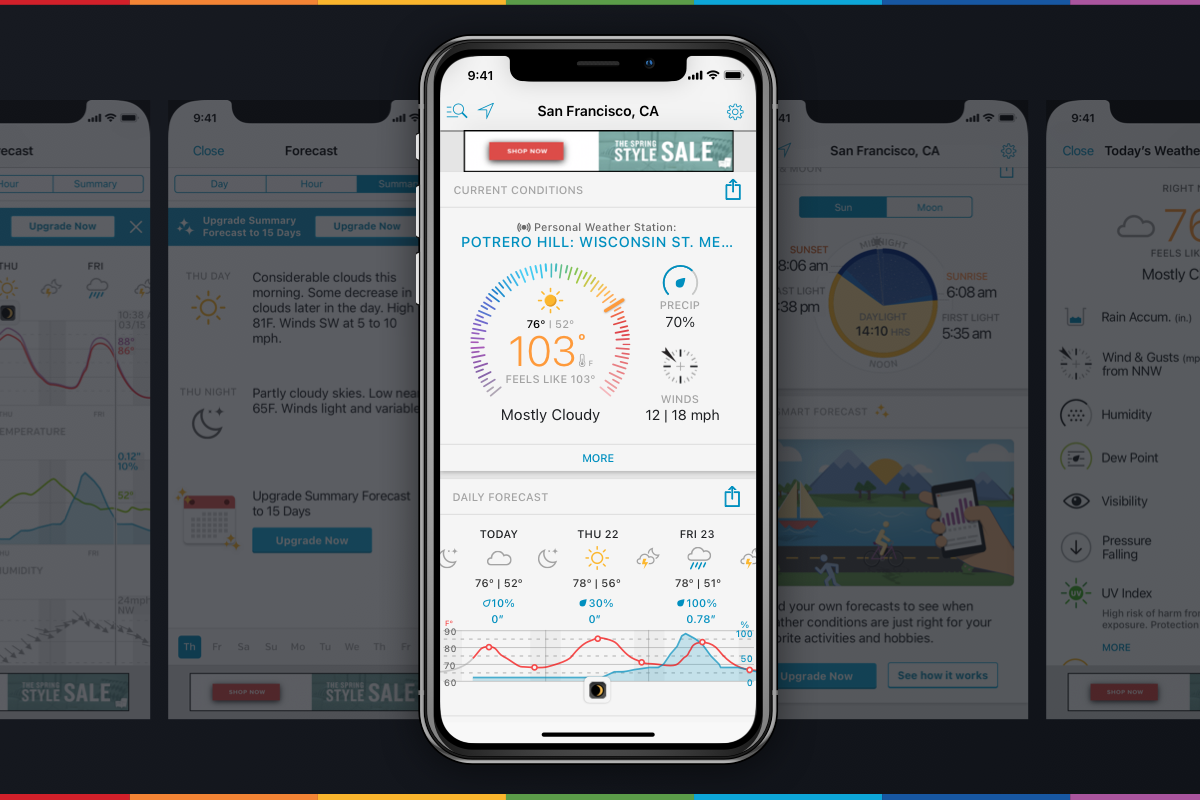
A progression of key screens from low to high fidelity mocks. These iterations were based on user needs from user interviews .
Prototype

User Testing
We not only applied a defined foundation with a card-based design system to the MVP, but we were able to apply severe weather, radar, and subscription features that resulted from each product review cycle during the duration of the project.
Goal + Methodology:
Goal: To successfully have the user navigate the personal weather station dashboard page in order to see how they accessed the weather station’s temperature data, where they would rearrange the dashboard modules, where they would explore data that interested them, and where they went to view a summary of the weather station’s historical data.
Methodology: The usability test consisted of twelve users and a set of tasks written out to be followed by the user.
User Testing Tasks:
Task 1: Describe how you are currently getting to your station’s page on WU.
Task 2: What information on this page is helpful or interesting to you?
Task 3: How would you go about getting your station’s current temperature reading?
Task 4: Where would you rearrange the dashboard modules and how would you go about reordering the data modules on the page?
Task 5: Where would you retrieve the historical summary of your station’s data over the past month?
Outcomes
Understand that the current technologies and certain features will be rolled out slowly from the MVP’s launch. Even though I had plenty of ideas, I had to sometimes step back and consider if they were realistic with the dev team’s time and the restraints on code bases and APIs that we didn’t have at the moment or had to build from scratch.
Next Steps:
Implement empty state conditions.
Work with dev to assess the development time for the rearrangement of modules feature on page.
Work with dev to implement the expanded data state for weather data modules.
View More Projects